Can the expenses for creating mock data in unit tests become a source of business profit? Absolutely! Here’s how.

Most web applications, whether they are healthcare portals or shopping carts, require seed data with a user set that reflects all variations of application data associated with those users. This set is a crucial part of the deployment process to run integration and end-to-end tests. It is also essential for smoke testing before A/B deployment activates the infrastructure components with new code.This is a well-known pattern used in most enterprise-quality software products.
Restricting such valuable data solely to the deployment process is a missed opportunity in various business use cases and throughout the Software Development Life Cycle (SDLC).
You might wonder how this data can have any business value?It seems like just an unavoidable product maintenance cost. And you would be right—until your app needs to be indexed by search engines and operable by AI assistants for user-specific parts of the application. Of course, exposing private user data is not an option. This is where synthetic personas from seed data become invaluable. Since this data set does not contain any real personal information, it is safe to expose to search engines and AI crawlers. If the app is developed with accessibility compliance and SEO in mind, these business goals can be achieved.
In SDLC the seed data can ( IMO should ) be propagated into mock data for the UI components and pages to be used in
* StoryBook
* unit tests
* serverless UI run
* e2e integration tests.
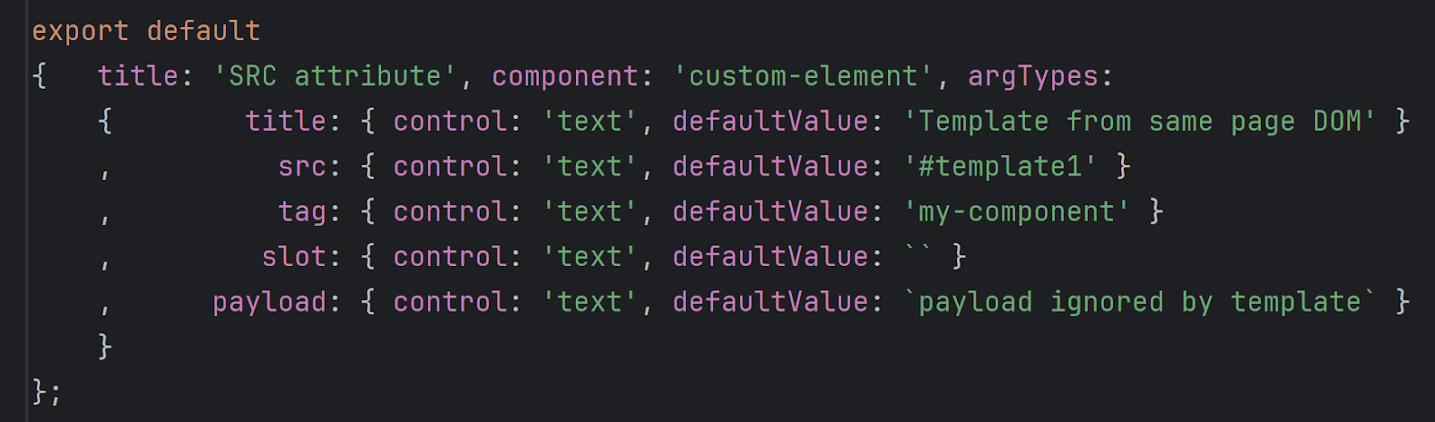
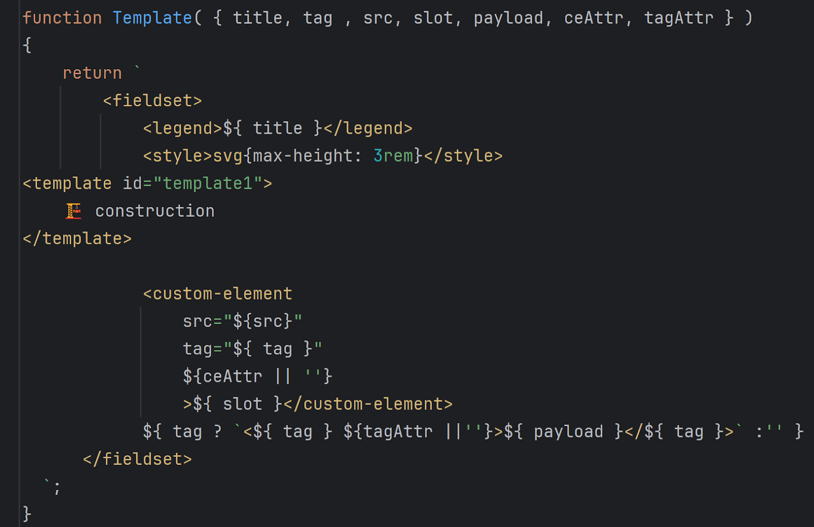
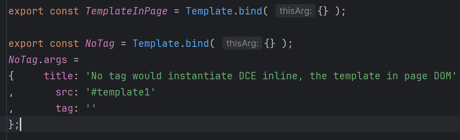
Data can be saved as a module, better with strict typing in place. If your project uses TypeScript, Java, or C#, that is the format to use.
One of the advantages of GraphQL is its ability to generate client code for target languages such as TypeScript or Java. In similar fashion your script can crawl through all graphql queries in application and execute them on behalf of each synthetic persona in the data seed. The same mock generation routine should also generate the Mock Service Worker (MSW) handler to be used in StoryBook, unit tests, and serverless mode.
If your mocking frame with seed data that can be created ahead of UI components, it would be a huge time saver for developers and QA as there will be no difference on data protocol on all those aspects of application front-end.
Once the mocking is available for each synthetic persona, the MSW would help to run the front-end without back-end helping to validate the UI in isolation with the same test set as the full e2e/integration test. It would enable you to identify the tier which is responsible for the failed test without the need for manual troubleshooting for finding the guilty front-, back-, or DB side and forwarding to responsible team members if your tiers are implemented by different folks. Or just simplify the fix if your people are full stack developers.
While SEO, search engine indexing, and AI vectors are separate topics, here I just want to point out that pages with synthetic persona data would be publicly available, improving your site visibility and empowering your application users with AI assistants.
My team has implemented most of the design outlined above, and is currently finalizing the business use. I would be glad to discuss the impact of such an approach on your product.
Happy coding!