Showing posts with label UI. Show all posts

2024-04-10

UI TDD with StoryBook

 The Test Driven Development process assumes the incremental steps of module logic improving starting with unit test following the implementation in the source code. As unit test is created, it immediately should fail as the logic still has to be done. Once logic is in place, the next feature added to the unit test and the cycle repeats…


The UI development used to be different as there was no ability to do the checks and incremental code improvements. The module (UI component) used to be tested within the web application without insulation and ability to visualize the variations without app state change or the following the whole flow leading to the UI variation. Till the StoryBook became a natural part of UI SDLC. 


What is a StoryBook? It is a toolkit for various aspects for UI development. 


When installed inside of the web UI project as a NPM module, it allows to run the components collection with all variations within the StoryBook interface which is not attached to the actual web app your team is working on. Instead, it exposes the collection of UI components hierarchically organized and exposes the samples of the UI variations and use cases.


Of course the UI has a lot of aspects besides basic variations. Those include but not limited to:

  • Color theming: dark, light, high contrast light/dark

  • Language switch

  • Various screen sizes and mobile variations

  • Accessibility: 

    • blurred vision, limited colors, etc.

    • Screen reader 

    • Keyboard navigation

  • Set of mocked user roles

And so on… All the listed is covered by StoryBook making it “a must” part of the UI development stack. Which is especially important for enterprise grade applications bound by various compliance requirements.


Compliances aside, StoryBook gives the frame to practice TDD during UI component development. Once the SB UI is running, developers would be able to work on individual UI component in insulation. 

( in examples I use the “native” JS web components, the React or Angular typescript module work in similar fashion )

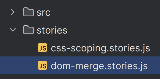
  1. For xxx module, create the xxx.stories.ts file either in the folder for component or in directory dedicated for stories

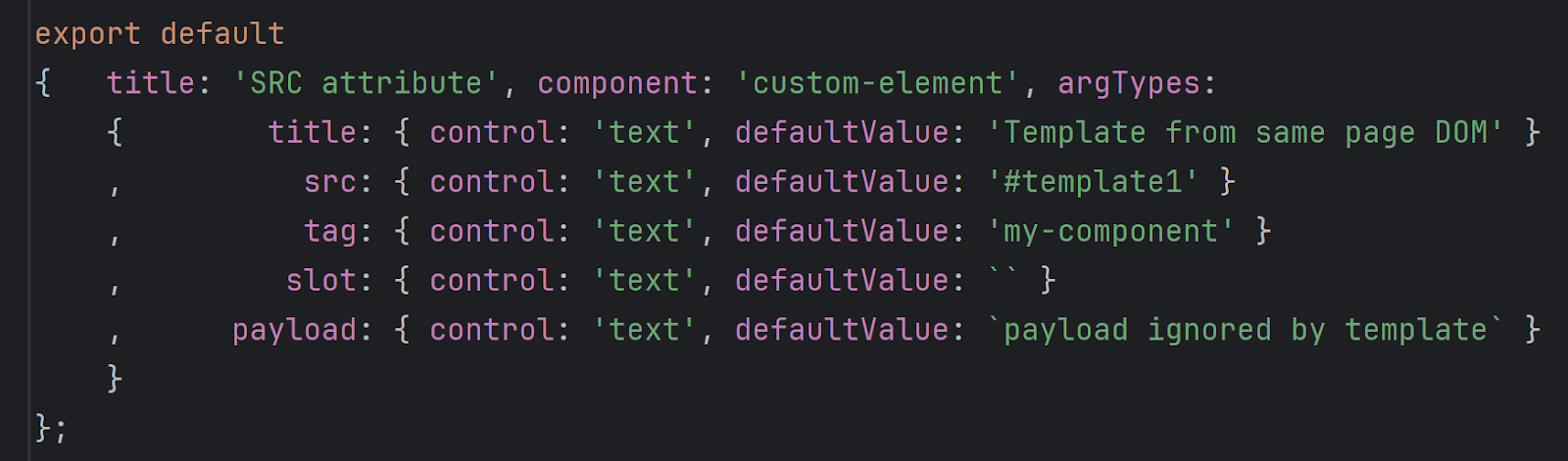
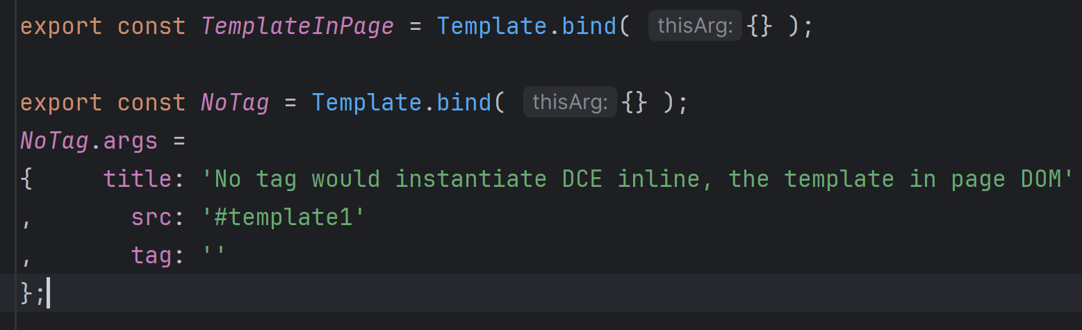
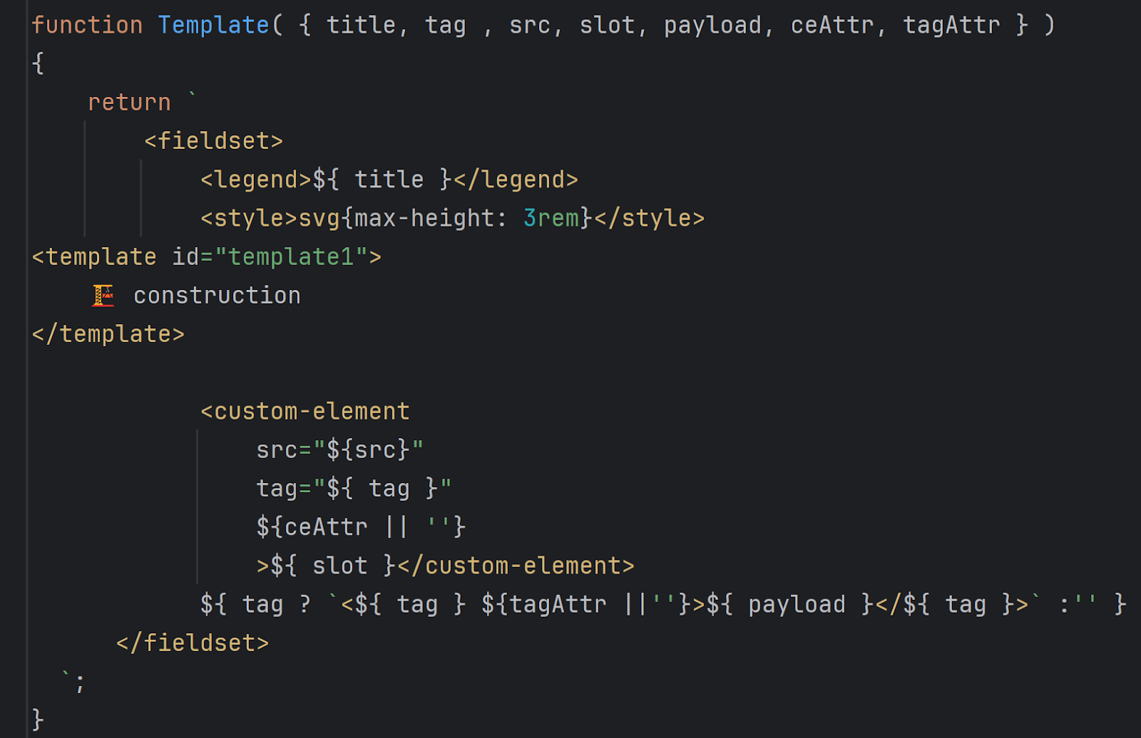
  2. Inside of .stories.tx file you would keep the UI variations of component (similar to unit tests variations). Those would export

    1. Parameters set for SB which should cover all use cases 
  1. Template to render component UI with parameters ^^

  2. Use cases. A template to particular parameters binding.
Once the use cases created, they would be listed in SB interface. To work with component in insulation, there is a “Open Canvas in new tab” button:
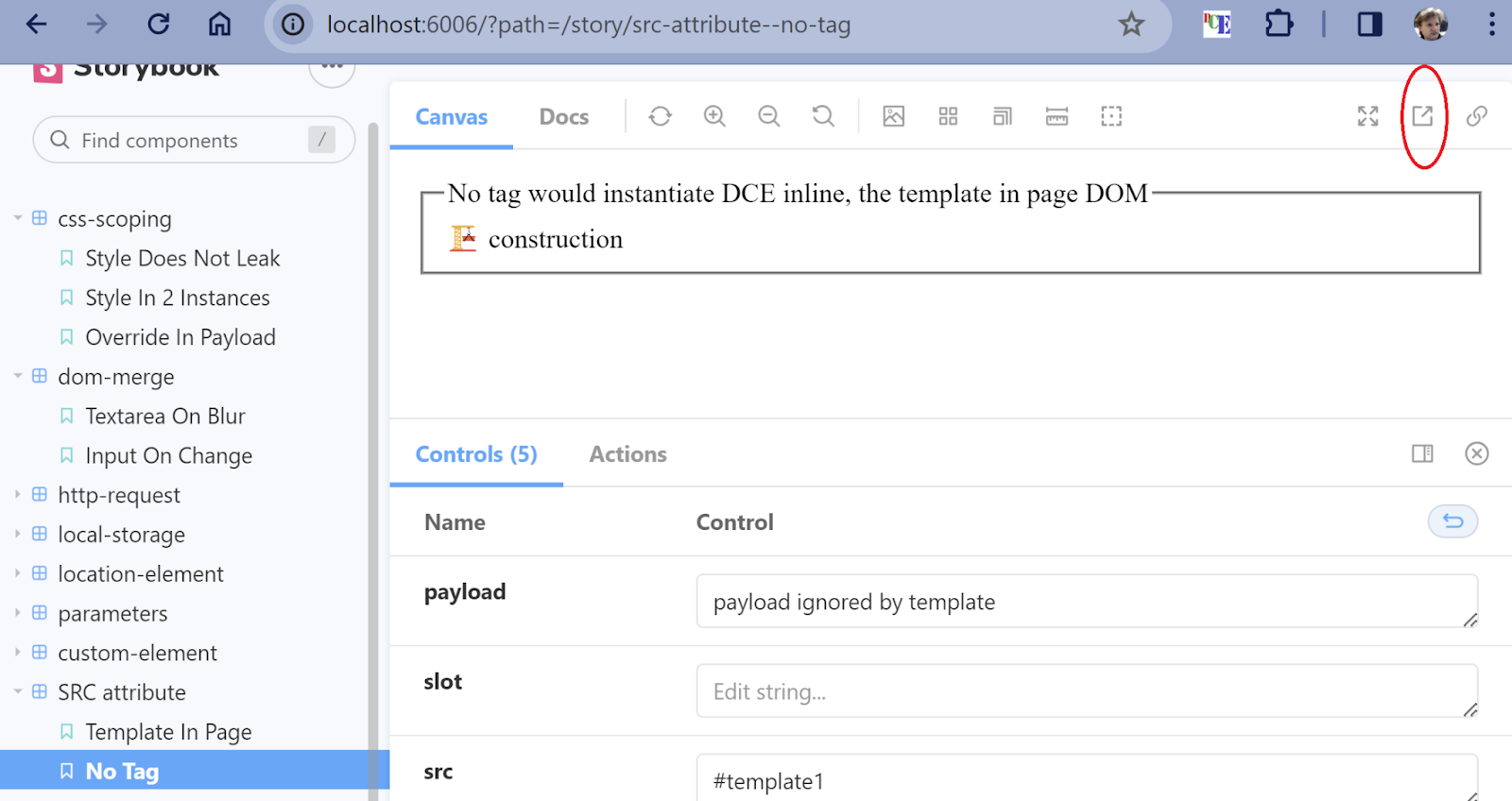
That is where the primary development for your component would be shown:
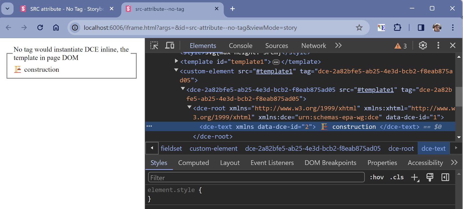
As SB is served in the browser, the dev tools at your service to inspect the UI styles, debug code, etc. The code hot reload allows you to change the code and immediately see the affected UI.


StoryBook gives you the ability to integrate with Figma and other UI design services. The link inside of your story would lead to the UI design to compare the components against design.


Once your component is ready and becomes a part of the application, it is important to check whether following changes break any UI appearance. The pixel comparison tools like Chromatic or SauceLabs Selenium would give you ability to:

  • See the pixel difference between original and code in pool request

  • Engage UX team in visual changes approval

That assures there are no UI regressions introduced by pool request.


Here we touched just UI TDD aspects, but other features by SB are not less important in enterprise grade UI.

The StoryBook is well detailed on https://storybook.js.org and covered by multiple web and video blogs. 


<custom-element> test project used as example. Happy coding!

2021-04-15

Semantic Theming - indexed palette

There are many articles on palette categorizations online, I would skip to semantic relation of palettes to UX elements. 

Usually palette is selected from basic branded colors base. Usually 2 or 3 is sufficient, perhaps it relates to the heraldic symbols and colors. Remaining colors are chosen with keeping the base ones and emotional palette in mind. 

There is a catch on selection enterprise and government designs are facing: color set should be "accessible" for various cohorts of people: color blind, light sensitive, etc. Adobe has given a nice tool to help with accessible palette creation. In regards to color "accessible" means that close colors should be distinctive enough even for people with color challenges or in applicable conditions of low/bright light.

The palettes would have various colors but some of them have to be in straight color transition like bright to dim. Why you would need a color sequence? The answer resides in various states UX component are presented during interaction with UI. Those states are used in sequence: normal follows hovered, which followed "active"(pressed) , the disables should be least noticeable and resides in the end of color sequence. See Buttons and Actions states


How many color sequences you would need? It depends on how many color variations your application supports: light, dark, high contrast for each, grayscale for ePaper devices, etc. Another factor is munber of variations for UX components. As in Buttons and Actions there are 5 variations proposed, will be more for other types of UX components. Each need to have own entry in one of indexed palettes. 

While same palette could be reused for different UX components variations, it is better to choose a significantly distinctive different entry point in palette for inside of same color theme variation. 

For UX components single palette is not sufficient. The indexed palettes usually come in more than one color per row. You would need to make colors as for background as foreground/text, for outline, and for other sub-elements. For action it would be 3 colors: background, text, outline/border. The 4rth is assumed to come from theme variation background which is a basis for selecting proper entry within indexed palette. In this sample you could see the need to alter the text color due to background change:


Now to the meat of subject. The indexed palette become semantic when one of its entries is associated with one of semantic UX element variation. 


Semantic theming - buttons and actions states

 While W3C button attributes and CSS has given straight forward combination of possible appearance of actions/buttons, not all have a "semantic" meaning for the user. There is a proposal for state sequence in colors escalation order ( see indexed palette article ).

NORMAL  (default)

FOCUSED  :focus css selector

SELECTED attribute on some elements like OPTION 

HOVER  :hover

ACTIVE :active

DISABLED attribute, not available on A element

Not all states would affect background and not on all action variations: focused is usually leaves the current appearance with outline, in ghost variation the background by default would be transparent still for accessibility reasons keeping palette changes for other states.


2020-11-07

Semantic theming - buttons and actions

In semantic vocabulary the "button" is a wrong term which belongs rather to UI components. Button-like UI component could be presented as tabs, links, etc. There is common quality for all of them: the goal. Which is ACTION

There are PRIMARY actions which serve the main flow with one DEFAULT variation. Default action is emphasized in UI to highlight what would happen if you hit ENTER key or say "Submit", in the scope of current form or document. There is usually only one primary action on page/form/section.

NORMAL actions are serving various usual routine flows in app. On page usually there is more than one action. Usually it is implemented as a button.

ALTERNATIVE actions meant to swing the flow from usual. Often used for closing dialogs or cancel the multi-step flow.


DANGEROUS actions would need emphasizing of  potential danger for the flow they trigger. Often in red spectrum text, outline or even background. Delete, change the password or access key would be good samples for this kind of action. 


GHOST. The least important, de-emphasized in comparison with NORMAL. Often does not have own background and outline. Toolbar buttons are usual sample for such.


Synonyms and mixing up terms:

PRIMARY often used as a term for default action. In such case the "secondary" is used as a surrogate for primary and "tertiary" as surrogate for alternative.

ALTERNATIVE called a "secondary".

"info", "success", "warning", "danger" - all referring to different specialized flows. Which could be justified if your application has many flow "flavors" and some are common. In usual application there is no need for such generalization as flows actually meant to be limited and clear in understanding. 

HTML elements for actions

There are semantic HTML tags which match the proposed actions categorization. 

PRIMARY 

    button type="submit"
    input type="submit"
    input type="image"

NORMAL

    button
    button type="button"
    button type="reset"  
    input type="reset"
    input type="button"

Among other popular surrogates for buttons are A, LI, even DIV. 

NOTE: using unconventional HTML tags when there is a normal one in standard would break accessibility and user convenience. It would lead to warnings in most of developer`s IDE.

The rule of thumb for substitution of button with A hyperlink would be the missing onClick handler and URL in href.

CSS properties

Width and height are dictated by usability requirements: it should be distinctive enough among page elements, be large enough to be clickable by mouse pointer and comfortably tappable by finger.  That defines minimal dimensions. 

Do not define width or height directly! It is a dangerous technique. The text inside would either be trimmed or overflow the action area. Even if you do not have that effect on your screen, on some user environments the text could be completely different due to translator, text size customization by device and/or by user. If you could not omit defining the action UI outer dimensions be polite and use min-width and min-height instead. But in usual app it is enough to use padding and inherit the text size.

Font size & line height. Better to be left unchanged for the reasons of respecting the device manufacturer and user choice. The line height is good when it matches the font. There is no need to define line-height manually but if you want to override some 3rd party lib, there is no better value than 1EM. Otherwise on some devices user would see the text cut-off. The ideal value for font-size would be 1REM.

Padding is the primary property to define action UI dimensions. With 1REM as ideal value, there are some cases when it should be tuned up: icons and images would use more vertical space than text. The text button takes 3REM: 1REM for text 1 REM for top and bottom padding. As icon meant to be 2x larger of text, the padding for iconized button would be .5REM. For image there is no need for padding as whole image would fill the space of 3REM. 


TBD:

  • relation of action types with emotional and branded palette. 
  • CSS properties example with dark/light variations 

2020-08-22

Semantic theming - fonts in typography

The main purpose of typography is to make the consumption of various kind of content ergonomic: first distinctive and recognizable, then easy to read and comprehend.

The kind of content defines the semantic categories for font characteristics set usually reflected in the purpose of content: 

  • reading - text, headers, tips,... - Roboto, SourceSansPro
  • script/code presentation - monospaced
  • initialism  - lone symbol/ mini tags / acronyms - barley
  • iconized - letter in/as icon, badge
  • tag - icon label, tag without background/border
Each category most likely will use own set of typeface, font type and font properties like spacing, size, weight, etc. 

Lets go over each semantic typography category and explore the purpose and applicable properties.

READING - I guess it is self-explanatory. The sentences, paragraphs and pages of text should be easy to read for hours. Besides of font it defines ergonomics for eye and even neck: you do not want your reader to swing eyes and head righ-left while reading the multi line text. The newspaper columns are good samples or solving such problem. I still love the books with 2-column page layout.  

SCRIPT - is a special kind of text which I love to read. Here the even space distribution and positioning of particular keyword and elements matter. Most of scripts have special formatters associated. A source of "holy wars" which do not have any winner. Accounting the industry standards and personal taste make ideal presentation almost impossible. But in same time gives personalisation advantage. Since each type of script have own semantic vocabulary, we will keep it aside for now focusing on most common features of script typography. Monospace font, keywords coloring. The light/dark background mode has a special meaning here and important to support.

INITIALIZM - usually a few letters used as a tag. The first letters of name as replacement for face image is a good example. It is often surrounded by rounded background. Used in spaced visually separated often interactive (clickable), custom state-aware UX elements.  

ICONIZED - the letter in icon along with image based icons. As icon itself should be at least 2x larger of average font size to assure picture recognition, the iconized letter size should match the image-based icons. While the font requirements are pretty same as in initializm, the dimensions should align to iconography. 


TAG - while the tag in outlined border or background usually match the "label" styling, tags could be shown without border and background. In this case they have to be distinguished by font properties. There nothing special about that except the contrast to the text around. Usually by larger font weight and size. Icon label and buttons text, horizontal menu items without borders fit into same semantics of atomic often actionable UX element. As the word "tag" in beginning of this paragraph :)
Extra spacing is dimensional requirement for such elements.