Showing posts with label WebComponents. Show all posts

2024-04-10

UI TDD with StoryBook

 The Test Driven Development process assumes the incremental steps of module logic improving starting with unit test following the implementation in the source code. As unit test is created, it immediately should fail as the logic still has to be done. Once logic is in place, the next feature added to the unit test and the cycle repeats…


The UI development used to be different as there was no ability to do the checks and incremental code improvements. The module (UI component) used to be tested within the web application without insulation and ability to visualize the variations without app state change or the following the whole flow leading to the UI variation. Till the StoryBook became a natural part of UI SDLC. 


What is a StoryBook? It is a toolkit for various aspects for UI development. 


When installed inside of the web UI project as a NPM module, it allows to run the components collection with all variations within the StoryBook interface which is not attached to the actual web app your team is working on. Instead, it exposes the collection of UI components hierarchically organized and exposes the samples of the UI variations and use cases.


Of course the UI has a lot of aspects besides basic variations. Those include but not limited to:

  • Color theming: dark, light, high contrast light/dark

  • Language switch

  • Various screen sizes and mobile variations

  • Accessibility: 

    • blurred vision, limited colors, etc.

    • Screen reader 

    • Keyboard navigation

  • Set of mocked user roles

And so on… All the listed is covered by StoryBook making it “a must” part of the UI development stack. Which is especially important for enterprise grade applications bound by various compliance requirements.


Compliances aside, StoryBook gives the frame to practice TDD during UI component development. Once the SB UI is running, developers would be able to work on individual UI component in insulation. 

( in examples I use the “native” JS web components, the React or Angular typescript module work in similar fashion )

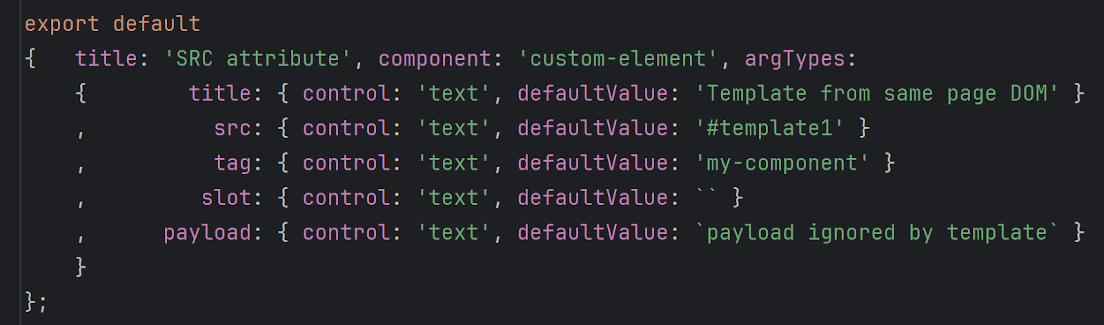
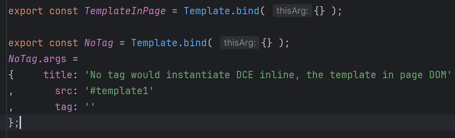
  1. For xxx module, create the xxx.stories.ts file either in the folder for component or in directory dedicated for stories

  2. Inside of .stories.tx file you would keep the UI variations of component (similar to unit tests variations). Those would export

    1. Parameters set for SB which should cover all use cases 
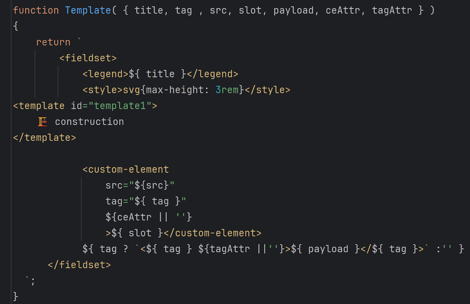
  1. Template to render component UI with parameters ^^

  2. Use cases. A template to particular parameters binding.
Once the use cases created, they would be listed in SB interface. To work with component in insulation, there is a “Open Canvas in new tab” button:
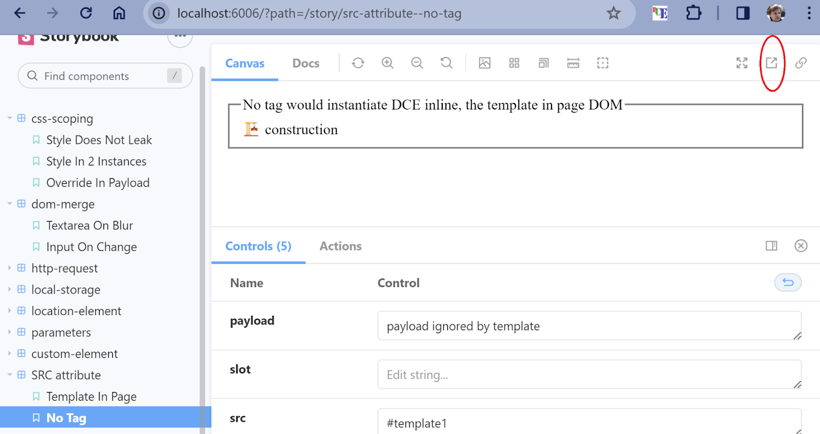
That is where the primary development for your component would be shown:
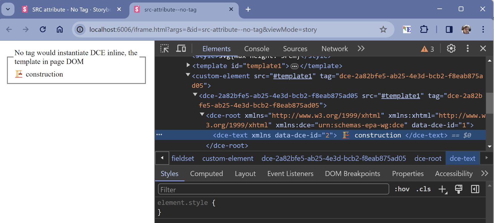
As SB is served in the browser, the dev tools at your service to inspect the UI styles, debug code, etc. The code hot reload allows you to change the code and immediately see the affected UI.


StoryBook gives you the ability to integrate with Figma and other UI design services. The link inside of your story would lead to the UI design to compare the components against design.


Once your component is ready and becomes a part of the application, it is important to check whether following changes break any UI appearance. The pixel comparison tools like Chromatic or SauceLabs Selenium would give you ability to:

  • See the pixel difference between original and code in pool request

  • Engage UX team in visual changes approval

That assures there are no UI regressions introduced by pool request.


Here we touched just UI TDD aspects, but other features by SB are not less important in enterprise grade UI.

The StoryBook is well detailed on https://storybook.js.org and covered by multiple web and video blogs. 


<custom-element> test project used as example. Happy coding!

2021-10-31

HTML5 SLOT tag for content management explained

Web Components stack includes efficient and well thought through templating solution with TEMPLATE and SLOT tags. While those have been widely adopted in web components world for multiple reasons, the shadow DOM behind of this tech prevents to use it in environments where UI styles managed separately and often driven by heavy legacy content: while styling in shadow DOM has own perks like css insulation, it does not work well with global css styling. 

I would suggest to utilize the concept of slot in template  in content management environments with classic css use. You could implement the convention by yourself with showing/hiding the slot with name  


el.querySelector('slot[name="final"]').hidden = false;

To avoid the UI flickering , make sure the initial HTML includes the visibility state meant to be shown before JS is able to act:


<slot name="initial">Please wait while loading...</slot>
<slot name="final" hidden> initially is hidden, filled by JS and then shown </slot>


NOTE. The hidden attribute behavior is self-explanatory and works out of the box, no need for CSS. But if your environment is a CMS like Adobe AEM, Liferay, or Drupal, the CSS on the page is most likely a product of multiple people/teams over the years. Here the default behavior could be tricked by different CSS rules and you would need to elevate:
        
slot[hidden]{ display:none!important;}

Of course the page level javascript and HTML would limit only one slot name a time. Wrapping slots combinations into identifiable by JS container would help to handle multiple UI components with same kind of UI pattern(template). Like the avatar in the list and in profile UI. 

The most convenient way to connect JS and HTML element is a custom element, i.e. Web Component with own tag. `this` in its methods would point to html element of own tag which would be triggered every time the tag appear in HTM, initially or dynamically later. In CMS it would prevent the messing with page, document, and script load handlers, a huge win for code maintenance when the code is spread across developers/teams and time.

Web Component does not dictate the use of ShadowDOM and allows to pick any way of template implementation. There are multiple "frameworks" with opinionated ways of templates handling. The HTML content meant to be handled by middle tier in classic CMS. Where the templates also play important role in content lifecycle. Adding another templating engine is not just increasing the complexity but also created the conflict between different approaches and handling the content variations like multi-lingual support or cohort targeting.  Hence ability to reuse the CMS HTML capabilities along with template/slot concept would be most beneficial.

As CMS usually is not designed to serve the dynamic data, the fusion of externally served data and UI from CMS becomes a data plumbing task on UI tier. During this "data plumbing" process the UI should support multiple states including initial waiting, loading, error of multiple kind, and final with rendered data, perhaps with variations on data internals.

slotted-element comes handy for eliminating the coding for data plumbing in simplest cases and simplifying the programming otherwise. 

Here this custom element is a sample for typical data plumbing to CMS driven HTML tasks.

  • switch between slots to be shown. Hide all, display only one. 
  • clone slot content to be filled with data
  • add customized slot. Could be more than once for list.
  • data retrieval layer: url/method/headers/body, status, error handling, fetched data conversion.
  • UI sub-elements access and manipulation convenience methods.

Whether you choose to use slotted-element, extend it, or decide to create own, keep in mind the list ^^. 

Links:

Using templates and slots


2020-10-10

Web Components Selenium test automation

The one of strengths of Web Components is shadow DOM. It allows to insulate the css rules scoping to own content, allows efficient memory use by sharing DOM, etc... But for QA folks it could make a challenge as usual CSS and XPath selectors would not work anymore. There is a way around.

Elements in Shadow DOM are not available via direct CSS or XPath. Instead you could use JS selector via "Copy JS path":

In this case the full selector is

full selector
document.querySelector("#container-a593f6c588 > div > div > div > div > div > shopping-list")
.shadowRoot.querySelector("div.padded > vaadin-combo-box")
.shadowRoot.querySelector("#input")
.shadowRoot.querySelector("#vaadin-text-field-label-0")

which could be shortened to 

trimmed selector
document.querySelector("shopping-list")
.shadowRoot.querySelector("vaadin-combo-box")
.shadowRoot.querySelector("#input")
.shadowRoot.querySelector("#vaadin-text-field-label-0")


For simplification in styles tables the series of CSS selectors and shadowRoot could be swapped with :shadow-root pseudoselector. CSS handler in this case should convert the string bello to JS above:

pseudo selector :shadow-root
jkp-shop-plans :shadow-root vaadin-combo-box :shadow-root #input :shadow-root #vaadin-text-field-label-0

the "Element locator" css should sniff for ":shadow-root" sub-string and replace with JS sequence above returning JS object. WebDriver has a By.js locator only in JS webdriver implementation. In Java you have to simulate it yourself. Fortunately that is easy via js Executor:

  1. String javascript = "document.querySelector('vaadin-combo-box').shadowRoot.querySelector('#input').shadowRoot.querySelector('#vaadin-text-field-label-0')";  
  2. JavascriptExecutor jsExecutor = (JavascriptExecutor) driver;  
  3. WebElement element = (WebElement) jsExecutor.executeScript(javascript); 


2020-04-05

JSM CDN use in stackoverflow sample

Newer thought to have JSM CDN useful in stackoverflow. If you check my answer, it is capable of running the sample inline from CDN.

   https://stackoverflow.com/questions/50404970/web-components-pass-data-to-and-from

Data from HTML attribute - Declarative Programming with Web Components

How to pass JSON string from HTML as object for data binding of Polymer Web Component?

The answer resides in embedding of data into URL of iron-ajax.
vaadin-elements-demo.html
<iron-ajax url='data:text/json;charset=utf-8, 
                [{"label": "Hydrogen", "value": "H"} 
                ,{"label": "Oxygen"  , "value": "O"} 
                ,{"label": "Carbon"  , "value": "C"} 
                ]'
           last-response="{{lifeElements}}" auto handle-as="json"></iron-ajax>
<vaadin-combo-box id="cbDemo"
        label="Label, value:[[cbDemoValue]]"
        placeholder="Placeholder"
        items="[[lifeElements]]"
        value="{{ cbDemoValue }}"
>
    <template>
        [[index]]: [[item.label]] <b>[[item.value]]</b>
    </template>
</vaadin-combo-box>
<vaadin-combo-box label="Disabled" disabled value="H" items="[[lifeElements]]"></vaadin-combo-box>
<vaadin-combo-box label="Read-only" readonly value="O" items="[[lifeElements]]"></vaadin-combo-box>

2020-03-15

Polymer 3 dom-bind event handling

Original intent

is to update the text when component.selection is changed
index-0.html
<textarea style="width: 100%;height: 9em" id="configtext"></textarea>
<button onclick=" navigator.clipboard.writeText(configtext.value) ">&boxbox; Copy</button>

<webcomponents-element visible="true" id="webcomponentsElement" ></webcomponents-element>
<script>
    window.addEventListener("load",()=>{
        webcomponentsElement.addEventListener("selection-changed",(ev)=>{
            configtext.value=webcomponentsElement.selection.replace( /,/g , ",\n");
        });
    });
</script>

using dom-bind

The change handler is still initialized in SCRIPT code:
index-1.html
<dom-bind id="configurator">
    <template>

        <textarea style="width: 100%;height: 9em" id="configtext"></textarea>
        <button onclick=" navigator.clipboard.writeText(configtext.value) ">&boxbox; Copy</button>

        <webcomponents-element visible="true" id="webcomponentsElement"
                               on-selection-changed="onSelectionChanged"
        ></webcomponents-element>
    </template>
</dom-bind>
<script>
    configurator.onSelectionChanged = function (e) {
        configtext.value = webcomponentsElement.selection.replace(/,/g, ",\n");
    };
</script>

Final version - The power of declarative programming!

No JavaScript, binding only via sel variable scoped in binding context of dom-bind.
index.html
<dom-bind>
    <template>
        <textarea style="width: 100%;height: 9em" id="configtext" value="{{sel::change}}"></textarea>
        <button onclick=" navigator.clipboard.writeText(configtext.value) ">&boxbox; Copy</button>

        <webcomponents-element visible="true" id="webcomponentsElement" selection="{{sel}}"></webcomponents-element>
    </template>
</dom-bind>

2020-02-20

polymer bi-directional databind within dom-repeat

Two-way databinding in dom-repeat could be based on extending the item model with component-specific field ( where it is a good habit to use component-specific prefix).

In sample the fieldset is shown only upon checkbox selection.

<ul>
    <template is="dom-repeat" items="[[forms]]">
        <paper-checkbox label="Enable [[item.name]]" checked="{{item.fieldset_enabled}}"></paper-checkbox>
        <template is="dom-if" if="[[item.fieldset_enabled]]">
            <fieldset><legend> '[[item.name]]' section </legend>
                ...
            </fieldset>
        </template>
    </template>
</ul>

2017-10-29

WebComponents via AMD - pragmatic view

What I need for apps is ability to use AMD dependencies for my and external web components:
  • use the external libs from their CDN on prod, and local on developer machine
  • own AMD-based JS loading web components via AMD (webpack, dojo, requirejs) dependencies
  • own HTML syntax web components which list dependencies in JS section via AMD
Why AMD API? It is running without any compilers/transpilers in browser and compatible with webpack in case of need the bundling.

Why AMD instead of ES6 imports?

While ES6 imports are giving ability to load module from relative path, that is not enough as libraries could be served from different locations including different domains. AMD provides runtime URL resolving based on configuration making a combination of local component development with CDN dependencies a breathe.

How to load WebComponents via AMD?

require([   "link-import!iron-demo-helpers/demo-pages-shared-styles.html|onload"
        ,   "link-import!iron-demo-helpers/demo-snippet.html"
        ,   "link-import!../test-element.html"
        ], (a,b,c)=> console.log(`${a}, ${b}, ${c} webComponents loaded`) );

Of course the AMD configuration should be set to define URL mappings and common script loaded

  var dojoConfig ={ async: true
                  , packages:
                      [ { name: "webcomponentsjs", location: webcomponent_root }
                      , { name: "polymer", location: polymer_root }
                      ]
                  , aliases:  [ [ "link-import"  , isLocal ? "/components/link-import/link-import.js" : "../../link-import.js" ]
                              , [ /(vaadin-)(.*)/, (m,x,y)=>`${vaadin_root}/${x}${y}`   ]
                              , [ /(iron-)(.*)/  , (m,x,y)=>`${iron_root}/${x}${y}`     ]
                              ]
                  , deps: [ "webcomponentsjs/webcomponents-lite" ] // common for all pages
                  };

Here the Polymer and Vaadin Elements are used as good example of WebComponent frameworks.

Your custom WebComponent could use Polymer 2.x syntax and defined as HTML. Just the script section will have a class declaration wrappd into define() and dependencies are listed as JS strings instead of link imports:

        const NAME = 'test-element'
        define( NAME
            ,   [   "link-import!polymer/polymer-element.html"
                ,   "link-import!iron-ajax/iron-ajax.html"
                ,   "link-import!vaadin-material-theme/vaadin-text-field.html" //,   "link-import!vaadin-valo-theme/vaadin-combo-box.html"
                ,   "link-import!vaadin-combo-box/vaadin-combo-box.html"
                ]
            , ()=>
            {
                class TestElement extends Polymer.Element
                {
                    static get is() { return 'test-element'; }

                    static get properties()
                    {
                        return  {   prop1: {
                                        type: String,
                                        value: 'test-element'
                                    }
                                };
                    }
                }

                window.customElements.define( TestElement.is, TestElement );
            });
        require([NAME]);

Where to find the working sample of loading and making WebComponent via AMD?

cdn.xml4jquery.com/ajax/libs/AmdHarness/link-import/test/demo/index.html

What library I need to use AMD loader in my WebComponent?

link-import on github or NPM

Want to go wild?

Help me with creation of module loader for JS and WebComponents as jQuery plugin. The async API for jQuery is already available via xml4jQuery, WebComponents integration is missing:
$('.my-el')
    .html('loading...')
    .linkImport('vaadin-combo-box/vaadin-combo-box.html') // path resolved by config
    .html('');
$('my-el')
    .html('loading...')
    .asWebComponent('vaadin-combo-box') // path resolved by config, WC loaded, and injected
    .prop('items',['red','green','blue]) // property assigned once WC is ready

//  will be auto-populated  even if the code run way later:
$.defineWebComponent( 'my-component' )
    .$on('load')
    .$then( ()=>$.get('colors.json') )
    .addWebComponent('vaadin-combo-box')
    .$then( (combo, colors)=> combo.items = colors );
Happy coding!